
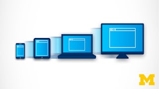
In this course, you’ll master advanced CSS techniques and responsive web design, enabling you to create modern, adaptive websites. By the end of the course, you'll be proficient in using Flexbox, CSS Grid, media queries, and container queries to build responsive layouts that adapt to various devices. You’ll also gain experience with rem, em, and viewport units for flexible typography and learn how to optimize your designs for mobile-first development.

Advanced CSS & Responsive Web Design


Advanced CSS & Responsive Web Design
Ce cours fait partie de Spécialisation Modern HTML & CSS From The Beginning 2.0

Instructeur : Packt - Course Instructors
Inclus avec 
Obtenez un aperçu d'un sujet et apprenez les principes fondamentaux.
niveau Intermédiaire
Expérience recommandée
11 heures pour terminer
3 semaines à 3 heures par semaine
Planning flexible
Apprenez à votre propre rythme
Ce que vous apprendrez
Learn how to use Flexbox and Grid for responsive layouts.
Master media queries and container queries for adaptive design.
Understand how to implement rem, em, and viewport units for typography.
Gain hands-on experience creating responsive web projects and forms.
Compétences que vous acquerrez
- Catégorie : Typography
- Catégorie : Version Control
- Catégorie : Front-End Web Development
- Catégorie : Application Deployment
- Catégorie : Web Content Accessibility Guidelines
- Catégorie : Web Design and Development
- Catégorie : Mobile Development
- Catégorie : Git (Version Control System)
- Catégorie : Responsive Web Design
- Catégorie : Cascading Style Sheets (CSS)
- Catégorie : GitHub
- Catégorie : Web Design
- Catégorie : HTML and CSS
Détails à connaître

Certificat partageable
Ajouter à votre profil LinkedIn
Récemment mis à jour !
avril 2025
Évaluations
9 devoirs
Enseigné en Anglais
Découvrez comment les employés des entreprises prestigieuses maîtrisent des compétences recherchées

Élaborez votre expertise du sujet
Ce cours fait partie de la Spécialisation Modern HTML & CSS From The Beginning 2.0
Lorsque vous vous inscrivez à ce cours, vous êtes également inscrit(e) à cette Spécialisation.
- Apprenez de nouveaux concepts auprès d'experts du secteur
- Acquérez une compréhension de base d'un sujet ou d'un outil
- Développez des compétences professionnelles avec des projets pratiques
- Obtenez un certificat professionnel partageable


Obtenez un certificat professionnel
Ajoutez cette qualification à votre profil LinkedIn ou à votre CV
Partagez-le sur les réseaux sociaux et dans votre évaluation de performance

Il y a 8 modules dans ce cours
In this module, we will explore the fundamentals of responsive design, guiding you through techniques such as flexible layouts, media queries, and responsive typography. You will learn to create adaptive and user-friendly designs across various devices and screen sizes, enhancing your web development skills.
Inclus
10 vidéos2 lectures1 devoir
In this module, we will guide you through building a responsive landing page with a form. You’ll learn to implement Flexbox for layout control, structure the HTML, and refine the design to be mobile-friendly using CSS techniques like media queries.
Inclus
6 vidéos1 devoir
In this module, we will cover various CSS features that elevate your designs. You’ll explore custom properties, vendor prefixes, filters, and the calc() function while learning how to enhance your website’s functionality and appearance with unique styling effects.
Inclus
8 vidéos1 devoir
In this module, we will build the Lumina Creative website project from scratch. You’ll work through each stage, from the initial setup and header design to adding interactive features like the lightbox effect, while refining responsive design practices.
Inclus
10 vidéos1 devoir
In this module, we will teach you how to manage your projects with Git and GitHub, deploy websites to Netlify, and set up domain names for professional web hosting. You’ll also learn how to securely manage your website’s code and collaborate using version control.
Inclus
7 vidéos1 devoir
In this module, we will introduce you to web accessibility, helping you understand its significance for inclusive web design. You will learn how to test your website for accessibility, implement ARIA attributes, and ensure that your site is usable by all users.
Inclus
7 vidéos1 devoir
In this module, we will dive into advanced CSS selectors, including pseudo-classes and pseudo-elements. You will learn how to create more dynamic and powerful styles using selectors like :before, :after, and new CSS functions for precise element targeting.
Inclus
11 vidéos1 devoir
In this module, we will explore CSS Grid in detail, showing you how to create flexible, responsive layouts. You’ll learn how to use grid functions, position items precisely, and combine CSS Grid with media queries to build adaptive web designs.
Inclus
14 vidéos1 lecture2 devoirs
Instructeur
Offert par


En savoir plus sur Mobile and Web Development
Scrimba
University of Michigan
Pour quelles raisons les étudiants sur Coursera nous choisissent-ils pour leur carrière ?

Felipe M.
Étudiant(e) depuis 2018
’Pouvoir suivre des cours à mon rythme à été une expérience extraordinaire. Je peux apprendre chaque fois que mon emploi du temps me le permet et en fonction de mon humeur.’

Jennifer J.
Étudiant(e) depuis 2020
’J'ai directement appliqué les concepts et les compétences que j'ai appris de mes cours à un nouveau projet passionnant au travail.’

Larry W.
Étudiant(e) depuis 2021
’Lorsque j'ai besoin de cours sur des sujets que mon université ne propose pas, Coursera est l'un des meilleurs endroits où se rendre.’

Chaitanya A.
’Apprendre, ce n'est pas seulement s'améliorer dans son travail : c'est bien plus que cela. Coursera me permet d'apprendre sans limites.’

Ouvrez de nouvelles portes avec Coursera Plus
Accès illimité à 10,000+ cours de niveau international, projets pratiques et programmes de certification prêts à l'emploi - tous inclus dans votre abonnement.
Faites progresser votre carrière avec un diplôme en ligne
Obtenez un diplôme auprès d’universités de renommée mondiale - 100 % en ligne
Rejoignez plus de 3 400 entreprises mondiales qui ont choisi Coursera pour les affaires
Améliorez les compétences de vos employés pour exceller dans l’économie numérique
Foire Aux Questions
Yes, you can preview the first video and view the syllabus before you enroll. You must purchase the course to access content not included in the preview.
If you decide to enroll in the course before the session start date, you will have access to all of the lecture videos and readings for the course. You’ll be able to submit assignments once the session starts.
Once you enroll and your session begins, you will have access to all videos and other resources, including reading items and the course discussion forum. You’ll be able to view and submit practice assessments, and complete required graded assignments to earn a grade and a Course Certificate.
Plus de questions
Aide financière disponible,